
Ressence Type 3 mechanical wristwatch by Benoît Mintiens. Photo: © Ressence
It was excitement at first sight with the Ressence Type 3 mechanical watch. Its smooth curves were one thing but what made it an emotional and attractive piece was its kitchen timer look.
Moreover, what captivates is the very inviting thought that perhaps you can actually adjust the settings by simply touching the dial. But that is not to be; it only appears so because of what the brand claims as the “world’s first world fluid-filled refraction-free display” on its Type 3 mechanical wristwatch.
“The orbiting indications are bathed in a fluid that refracts light like air so the indications appear to be displayed directly onto the sapphire crystal, closer to the eye of the beholder.
“The high contrast white indicators against the black dial appear to be projected onto the top crystal as if onto a screen,” according to Ressence. The result? “Type 3 offers a tangible feeling of being able to touch time itself.”
We agree. But how does it tell time given the somewhat complicated look? This is where its true beauty emerges.
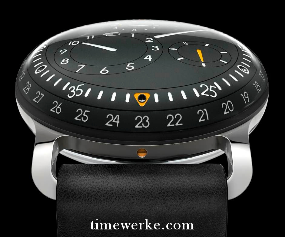
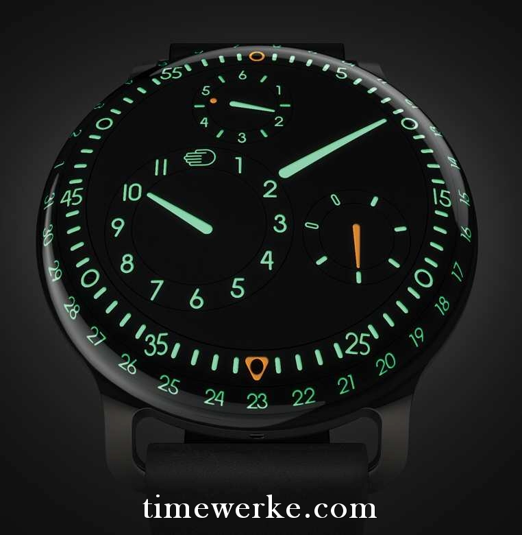
The time-telling features of the Ressence Type 3 are not as complicated as it looks. It only provides the hour, minute, seconds, day and date displays on the “regulator”-type dial.
The Type 3 mechanical watch provides highly legible time-reading of the hour, minute, seconds, day and date. Photo: © Ressence


Moreover, this timepiece, as highlighted by the brand does not have any hands. The “hands” seen are actually imprinted on the dial, well, rotating discs to be more precise. Do note too, that the entire dial revolves as well.
The longest pointer is for indicating the minutes, the shorter one for the hour and the sub-dial with the 1 to 6 numerals is for the continuous sweep seconds. The sub-dial with the orange pointer is for the days of the week where the two “empty pill-like” indexes represent the weekends, namely Saturday and Sunday.
The hand display on the hour disc which takes over the “responsibility” of the numeral 12 is actually the symbol of the brand. Is it not ironic that a “hand” logo is used for a watch with no hands?
Not really, as the brand notes that the hand is “a universal symbol of humanism”. More importantly, the hand “is also the icon of the harbour city of Antwerp in Belgium”. This is where the brand, founded by industrial designer Benoît Mintiens, is based.
The date, by the way, is referenced by using the orange triangle and where it points to.
The use of orange is a nice touch and something we very much enjoy as mentioned earlier in: “The power of the colour orange.”
It is therefore no wonder why it easy for us to enjoy the look of this watch which is a much improved version of their Series One. Somehow, there is this constant itch to touch the watch and the cure it seems, won’t come cheap because from what we understand, the Type 3 is priced at around 25,000 euros.