
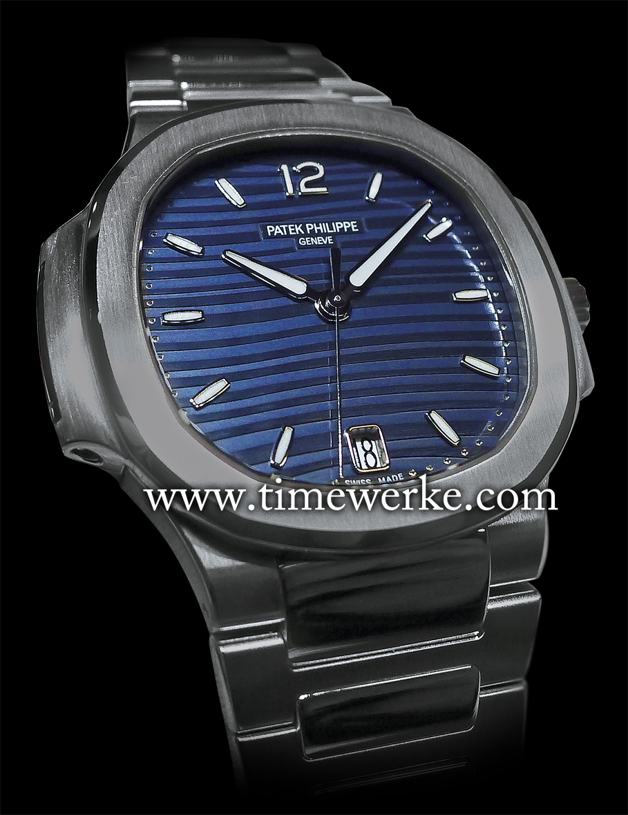
Patek Philippe Ref. 7118/1 Ladies Automatic Nautilus. Introduced in 2015, it is powered by the Calibre 324 SC automatic movement which is housed in a 35.2mm case in steel that is water-resistant to 60m. Photo: © TANG Portfolio. Elfa / Timmy. 2015 BaselWorld
What is the colour of the dial on Patek Philippe’s Ref. 7118/1 Ladies Automatic Nautilus?
Is it blue and black or white and gold? Or dark blue and light blue?
Well, this will surely not be a £50 question as the answer is pretty much straightforward and hopefully will not be accompanied with any complications.
The answer is dark blue and light blue. Patek Philippe describes it as a blue opaline dial. This is regardless of whether you wish to say it is dark blue stripes on a light blue background or argue that it features light blue stripes on a dark blue background.
Many will probably recall “The Dress” shared on social media in February 2015 that divided many – it was the dress worn by Cecilia Bleasdale for her daughter’s wedding. That £50 bodycon (figure-hugging) dress from British fashion retailer Roman Originals set off a debate with people claiming it was in white and gold on one side of the fence and blue and black on the other.
The reality is that “The Dress” is in royal blue and black, according to Roman Originals.
Quite a few reasons were offered for the differences in colour visualisation.
Professor Steven Pinker from the Department of Psychology at Harvard University states that the reason why there are differences in opinion between the colours does not stem from the inverted-spectrum paradox; neither do “rods and cones” (the two different types of cells in our eyes which allow the brain to visualise colours) have anything to do with it, according to a Forbes article published in February 2015.
Professor Pinker’s explanation instead hinges on lightness constancy and colour constancy. Lightness constancy explained as being in action using Edward Adelson’s checker-shadow illusion and colour constancy with the Rubik cube illusion as examples.
The NY Daily News also reported in February 2015 that Dr Reena Garg, assistant professor of opthamology at the New York Eye and Ear Infirmary of Mount Sinai, found the image taken of “The Dress” as being very poorly exposed.

Dr Garg explained that those who perceived the dress as being black and blue saw the image as being over-exposed; with too much light, the colours appeared darker.
For those who viewed it as gold and white, the image was under-exposed; with too little light, the colours appeared lighter because they had been compensated for by your retina.
We therefore recommend a reliable camera for wedding photos. Being biased towards Leica and Canon, these are brands we would opt for.
The Patek Philippe Ref. 7118/1 Ladies Automatic Nautilus features a blue opaline dial. In this 2015 model, the hour and minute hands have been re-designed. Photo: © TANG Portfolio. Elfa / Timmy. 2015 BaselWorld
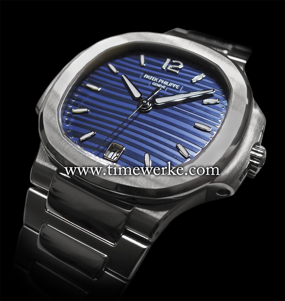
As for a matching timepiece for blue and black striped dresses, perhaps the watch to consider is Patek Philippe’s Ref. 7118/1 Ladies Automatic Nautilus with the blue-striped dial.
Hopefully, the images taken by us are not poorly exposed and therefore show the watch dial in its most realistic and colourful glory.
For those who may disagree with us on the Patek Philippe Ref. 7118/1 Ladies Nautilus, just like the differing opinions on the colours of “The Dress”, we humbly accept the differences in perception.